Branding actinutrition
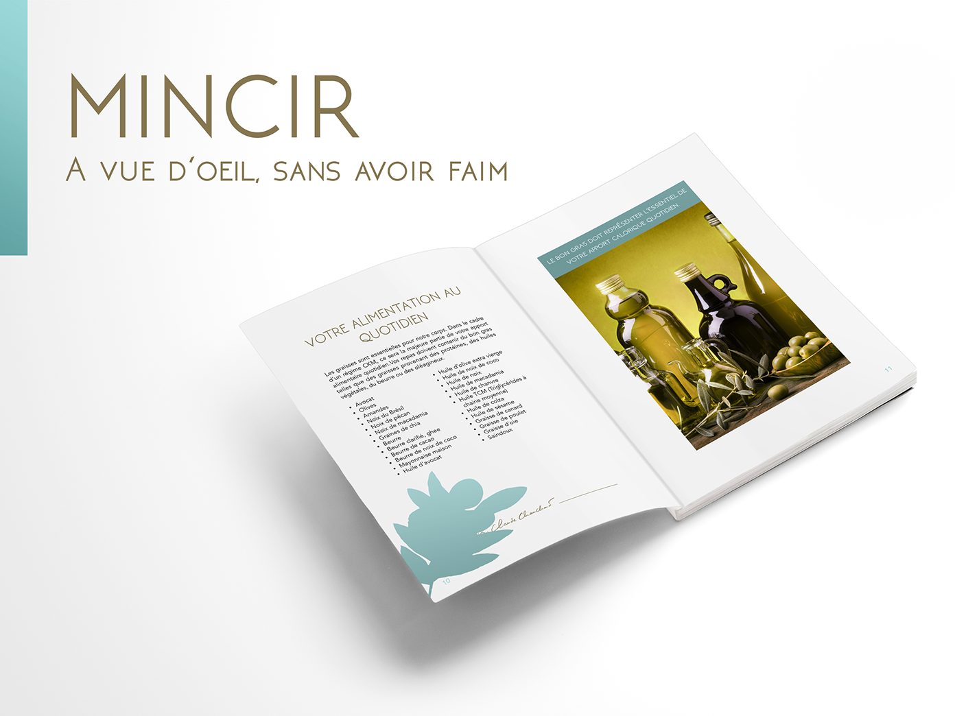
Branding project for a french health supplement and health coaching company. The new brand identity includes logo, colours, visuals and typography on a vegetal theme link to the phytotherapy DNA of the brand. The logo is in spiral shapes to reminds the mouvement of a mill and the energy It produces. The flower has been drawned with fine line, a wink at ancient angraved botanical illustration, reviewed with a more modern and geometrical approach. As one of the most appreciated gift in France, for all occasion, the flower symbolize the generosity and positivity values of the brand. The name has been simplified for a better legibility. Projet pour les laboratoires actinutrition : compléments alimentaires, phytothérapie et coaching santé ; création de la nouvelle identité visuelle incluant le logo, les couleurs, visuels et typographies.

